
Widgets
Widgets are the building blocks of your overlay. Each widget lives on the canvas and streams changes to your viewers in real time.
Adding a widget
Click Add Widget in the left panel, choose a type, and it appears on the canvas. Drag it where you want it.
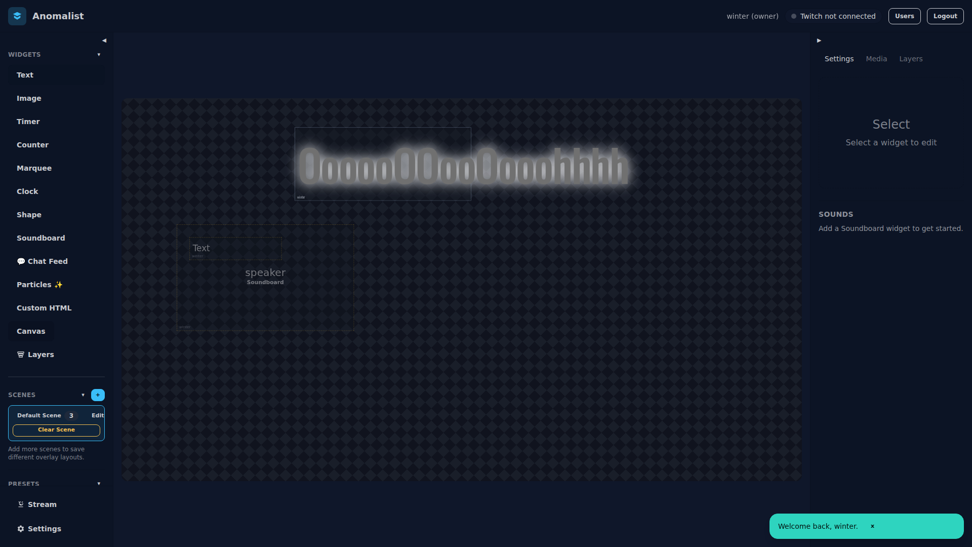
Widget types
Text
Display any text. Supports custom fonts (Google Fonts), size, color, alignment, and CSS effects.
Image
Show an image from your media library. Supports transparency.
Timer
A countdown or count-up timer. Uses wall-clock time so it stays accurate even if the server restarts.
- Countdown — set a duration, timer counts down to zero
- Count-up — starts at zero, counts up
Counter
A number you can increment or decrement from the dashboard or via chatbot commands (!counter [label] +/-).
Marquee
Scrolling text banner. Set speed and direction.
Clock
Live clock showing current time. Configure timezone and format.
Shape
Rectangle, circle, or line. Useful for background panels and dividers.
Soundboard
Trigger audio clips from your media library. Up to 4 sounds play concurrently.
Chat Overlay
Displays recent Twitch chat messages. Configurable max messages and auto-timeout.
Custom HTML
Write your own HTML/CSS/JS. Runs in a sandboxed iframe. Owner and editor only.
Particle Emitter
Animated particle effects: sparkles, snow, confetti, or fire. Powered by tsParticles.
Widget settings
Click a widget on the canvas to open its settings panel on the right. Changes apply instantly.
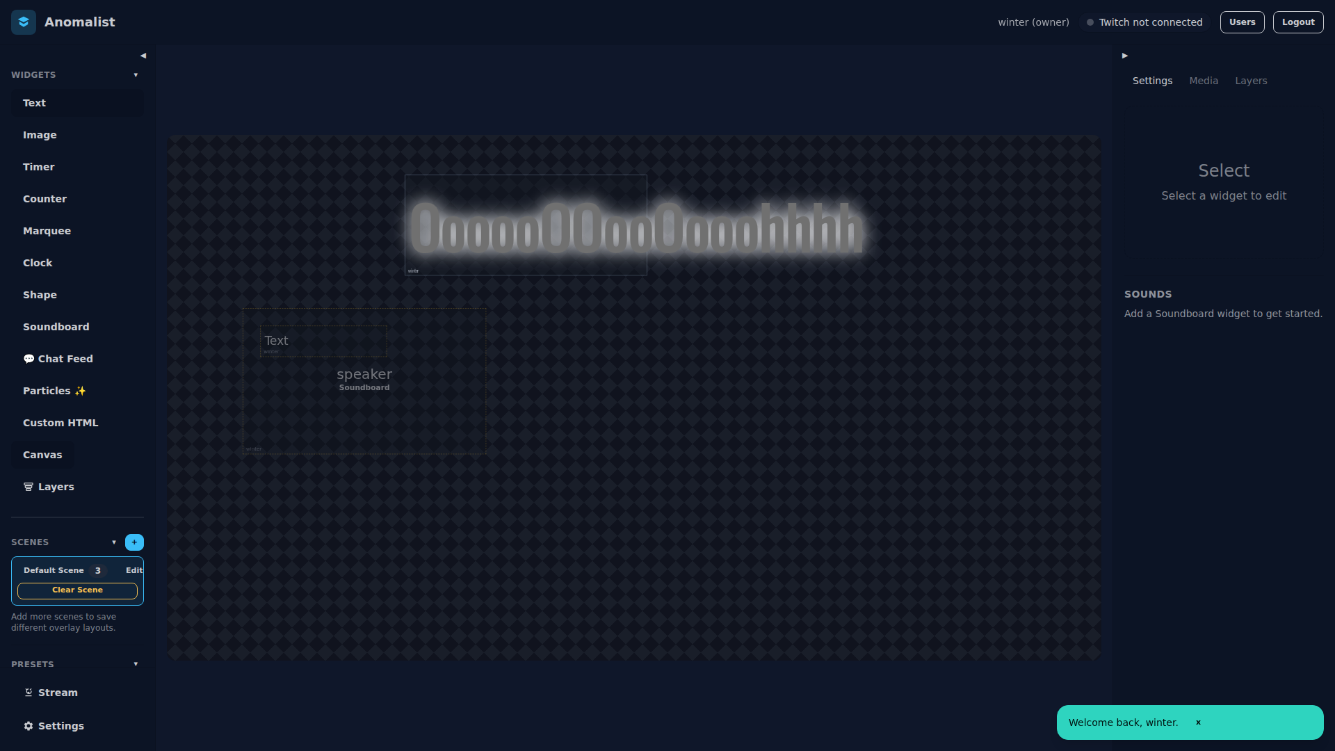
Effects tab
Every widget supports:
- Glow — colored outer glow
- Drop shadow — offset shadow with blur
- Outline — solid border around text/elements
- Gradient text — two-color gradient fill (text widgets)
Animations tab
Set an entrance animation that plays when the widget becomes visible:
- Fade, Slide (up/down/left/right), Pop, Bounce
Visibility
Toggle a widget on or off with the eye icon in the widget list. Changes are instant — no publish step needed.